How to use this gallery
- Scan by mood first: warm minimal, rustic texture, or soft neutral layers.
- Look for scale cues: bowls beside books, baskets near seating, textiles draped at rest.
- Note how natural light changes color, especially clay tones and linen weaves.
- Handmade pieces may show subtle variation; texture is part of the character.
Looking for process details?
See methods and material notes, including simple care guidance.
Visit CraftsmanshipCurated scenes and details
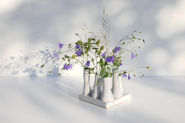
A selection of imagery designed to feel calm and tactile. Each frame emphasizes natural materials, quiet shadow, and balanced compositions. Use these scenes to plan a corner of your home, refine a shelf arrangement, or choose complementary textures.
Explore themes
Soft clay tones
Matte glazes and gentle curves for a grounded table or shelf.
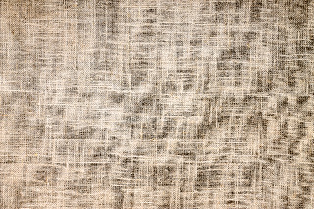
Woven texture
Natural fibers that add warmth without visual noise.
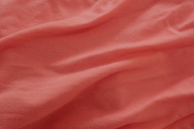
Linen layers
A simple way to introduce softness and depth in neutral rooms.

Quiet composition
Balanced grouping using negative space and varied heights.

Handmade finish
Subtle variation in glaze and edge detail that signals craft.
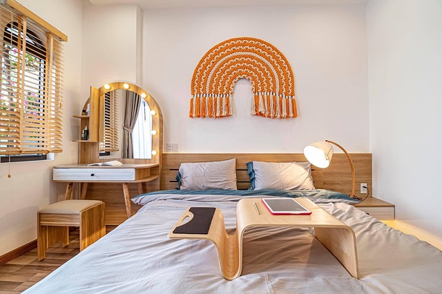
Shelf styling
Mix texture and shape, keep the palette cohesive and calm.
Styling notes to take with you
A calm interior is often built from a few well-chosen textures rather than many objects. When working with earthy tones, focus on contrast through surface finish, weave, and scale. Smooth ceramics sit beautifully beside nubby linen. Woven baskets bring warmth that feels architectural when placed near low seating or in open shelving. Clay tones can appear richer next to warm white and linen, especially in indirect daylight.
If you are planning a refresh, consider starting with one anchor element such as a large ceramic vessel or a substantial woven basket, then add supporting pieces in smaller sizes. Keep the palette restrained and let texture do the work. For more structured ideas, explore the Journal, where we share room-by-room approaches and practical tips for layering.
Layer with intention
Combine two to three textures only: for example, matte ceramic, linen, and woven fiber. Repeat tones across the room to keep the look cohesive.
Use scale as a tool
Larger pieces create calm because they reduce visual busyness. Add smaller accents sparingly, leaving space around them for clarity.
Let light guide placement
Place textured pieces where daylight grazes the surface. The shadow detail in weave and glaze adds depth without changing the palette.
Keep reference notes
Save ideas that feel true to your space. Our Journal articles are written as practical guides with a calm editorial tone.
Want help choosing a direction?
Send a short message and we will respond by email with relevant guidance.